Cohort analysis is the single most important view of your customers that you can have. With this one single chart, each of the following questions can be answered:
- When are a group of customers most likely to leave my platform?
- After how long does the risk fall and stabilise?
- How is churn risk changing month-on-month?
- How has our new content or messaging changed churn trends?
It seems almost impossible that one chart can answer all of these questions. But cohort analysis can.
In this article we want to show that cohort analysis is not just an advanced technique for data wizards. It is actually a very simple analysis to understand. And once understood, it accelerates your understanding of your customers like no other analytics can.
So what exactly is cohort analysis?
First of all let’s deal with this strange word ‘cohort’. It’s a carry over from the days when only data scientists could conduct cohort analyses. A cohort is just a technical term for a group of similar customers.
A cohort analysis is a way of tracking these similar customer groups over time. It makes it possible to trace the evolution of the group, and understand at a glance their churn pattern.
Most important if all is that cohort analysis is actionable. It is a tool designed for making decisions and for evaluating if your past decisions have brought you results.
To understand how it does this, we first need to quickly cover how this chart should be read.
How to read your cohort analysis
What makes cohort analysis a bit scary at first glance is obvious, rows and rows of numbers!
In reality, however, there isn’t that much complexity. Here are the three things to understand for reading just about any cohort chart:
- Each row is customer group (or cohort)
- For each group time passes from left to right, with the % of customers still active displayed
- Blank cells are in the future
And that's pretty much it!
Modern cohort charts like the one you find in ChurnIQ also use colour to draw your attention to change in the size of the cohort. The more customers who leave in a given month, the more dramatic the colour change.

Each row in a cohort chart represents customers who are similar to each other in a way that:
- is important in real world terms
- makes them easily comparable to another group
In ChurnIQ, the two types of customer groupings used are (1) when the customer signed up and (2) what channel they signed up through.
Now let’s look at the insights you can get from using this type of analysis.
How to use your cohort analysis
The classic customer cohort is the signup cohort. Let’s use the tips we’ve reviewed to read this signup cohort analysis:
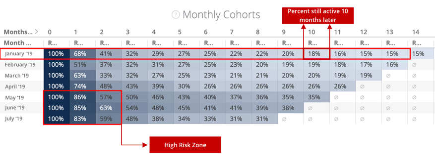
Each row here represents a separate group of customers, labelled by the month they were acquired. Each column represents x months after that signup month. So for January 2019, column 1 means customers still active at the beginning of February 2019, column 2 refers to those active at the beginning of March 2019, and so on.

Let’s use this chart to answer 3 questions.
1. When are customers most likely to leave?Looking at the most recent cohorts (bottom 3 rows) there is a clear answer to this:
- Decrease by the month after signup (column '1') is 15-17%
- Decrease by the second month has risen to 40-43%
We can see that customers are most likely to leave in the first 2 months, with the second month after signup being the highest risk period. By the beginning of month 3, almost half of each group has been lost!
This can be alarming, but unfortunately is not atypical for subscription platforms. This is what makes retention so important for subscription services.
Now that we know when churn risk peaks, the next thing we need to do is figure out when it stabilises, and how our current strategies are helping.
2. When does risk stabilise?
Returning to our chart, we need to figure out where our customer groups start to stabilise. Let’s take a look.

Some clear patterns emerge:
- Churn risk falls dramatically after the 3rd Month
- From Month 3 to Month 4, the decrease averages about 6%
- Between Month 4 & Month 7, the total amount of churn is around 8-9%
This is a stark contrast. By the start of the 3rd month we’ve lost 50-55% of our customers, but in the following 3 months the loss is a tiny fraction of that.
The takeaway is very clear. The customers still coming back at the start of Month 3 are a very stable group who we can expect to bring lots more value.
We now have a new question, how much progress are we making in retaining customers through these volatile first few months?
3. Are our strategies making a difference?
This is the most important question of all. Are we actually making progress with our retention efforts, whether they are in the product or in our marketing campaigns.
To figure this out we will stop looking at our chart from left to right, and start looking at it from top to bottom.

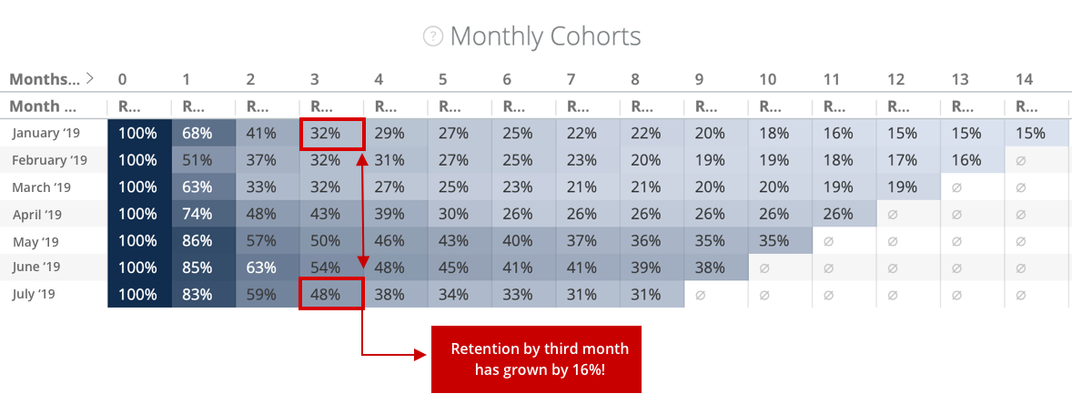
Since we know that it is a crucial point in stabilising a cohort and turning them into long term customers, we are going to look at retention rate by month 3:
- For the first cohort (Jan '19), 32% are still active at the start of the third month
- For the last cohort (Jul '19), 48% are still active at the start of the third month
- The first major improvement in performance came with the April '19 cohort
This is a crucial insight. Between the January & July cohorts, there is a 16% difference in the rate of retention after 3 months!
This shows major improvement in retention outcomes. There is something clearly different about how these two groups experienced your product.
The Impact of Cohort Analysis
This type of analysis is extremely powerful for understanding if your efforts are taking you in the right direction. Whether it’s that marketing campaign you worked on, or that content you invested in, it’s vital that you know much of a difference it has actually made.
Your customers’ relationship with your service is complex. What is essential for improving this relationship is that you can trace effort-outcome effects without having to process all of that complexity every time.
That is what cohort analysis is for. It presents very complex data operations in a very simple framework, and gives you a solid foundation for understanding what has truly helped to build longer relationships with your subscribers.


