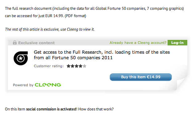
We continue to improve all steps of the conversion funnel: it first started with the introduction of subscription options 1month ago, and then 2 weeks ago we released a major shopping-cart & payment methods upgrade. Today, after several weeks of fine-tuning, we are very pleased to announce the release of a new in-page layer.
Some of you gave feedback that the past layer was too pro-eminent in your pages, and could look a bit bulky if you start to have 2 or 3 on the same page (for example, to sell songs). You thought also they were to many elements for the user to click on.
Well, now it looks a lot better, and we like it a lot. See this site -SpeedProfs- who deployed it yesterday evening, and did a nice integration work:
What changed:
- Top bar is much thiner, with clear mention of "Exclusive content", putting emphasis on content quality. The Cleeng logo disappeared from the top.
- Removed the content type symbol (Articles, videos, photos etc...) as we realized that most sites actually only publish a single type of content.
- Better position your brand: Reminder, you can add your icon either during setup, or within your settings page.
- More contrast and emphasis on the "call to action", ie the "Buy button"
We will continue to work in the coming weeks to provide more flexibility and options so to make Cleeng integration on your site work like a breeze.
We don't need to remind how the older version looked-like ;-) Please tell us what you think about this new version, and how we can further improve it &/or create versions which better fits your needs.
Thanks!


